In the world of network marketing, lead generation is the life blood of your business. Without leads, your business is dead in the water. It’s call lead poverty.
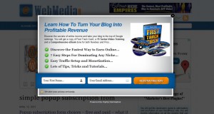
So naturally, home based business owners will try almost everything under the sun to generate quality leads. One method commonly used is a popup contact form on their website or blog. We’ve all heard both positive and negative feedback about popups. We’ve been to the sites which have so many popups that you can’t even access the content you’re looking for and are forced to leave the site. And by leaving the site, you get another popup saying, “Wait! Don’t leave. Blah, Blah, Blah.” It can be extremely annoying.
A popup can be both good and bad depending on how it is integrated into the site. It has to be done in a certain way to be effective, and at the same time, not scare away your visitors.
Should you add popups to your website?
Let’s discuss the “do’s” and “don’ts” of adding a popup to your blog or website.
The Do’s
 When adding a popup form to your website, I highly recommend using Aweber. They make adding forms to your site extremely simple and if you’re decent at graphic design, you can create a real handsome looking form that will entice people to fill it out. For more information about different software you can use, here’s a post I wrote about starting an email marketing campaign.
Form Placement – If you’ve opted into a popup, I would recommend having it appear right in the middle of the screen. If that doesn’t appeal to you, insert a footer form that appears at the bottom of your site.
Form Entrance –Â The most subtle forms are the ones that gradually fade into your website after having been on the site for around twenty seconds or so. It gives your visitors a chance to see the quality of your content before hitting them up for a commitment.
Form Design – Make the form fairly decent in size and as it fades, have it fade out the background so that all of their attention will be focused only on the form. Make sure it’s a form they have to close in order to get back to your content. Add some graphics to the form using tasteful arrows, small images or words that have a call to action. Make sure the input labels and their titles are larger than average website text. It’s more enticing to fill out.
Why Fill It Out – Having a popup form on your site with nothing to give your visitors will not work. In order to be effective, you’ll want to offer something for free. That can be an e-book, an email training series, a subscription to your blog, an actual tangible item or an opportunity to learn more about your business. Tell them why they are filling it out and how it will benefit them in as little words as you can.
The Don’ts
Don’t…
- add a popup that prevents them from leaving your website. If you do, they are sure to never come back.
- add a popup form that follows them as they scroll up and down your site. If you’re going to add a popup form, make sure it takes control of the site so that they have to close it in order to return to the content.
- make your form too flashy. Adding things that blink or flash will just make your site look tacky.
- have your form pop up immediately. Give your visitors about ten to twenty seconds to look at the content.
- have more than one popup form on your site during the same visit. That’s just annoying.
- have the same form popup every single time they visit your site. Disable the popup for returning visitors. Aweber will add a cookie to their browser that recognizes whether or not they have been to your site. But you have to select that option in Aweber. It isn’t automatic. You want your returning visitors to keep coming back.
In conclusion, from my experience, if you can stick to these guidelines, you’ll do well with a popup contact form or subscription form on your site. Be sure to experiment on your own and find the best recipe that works for you. It can be different for each unique site.
If there are tips you’d like to share that have worked well for you, please leave a comment. Thanks!


